Introduction
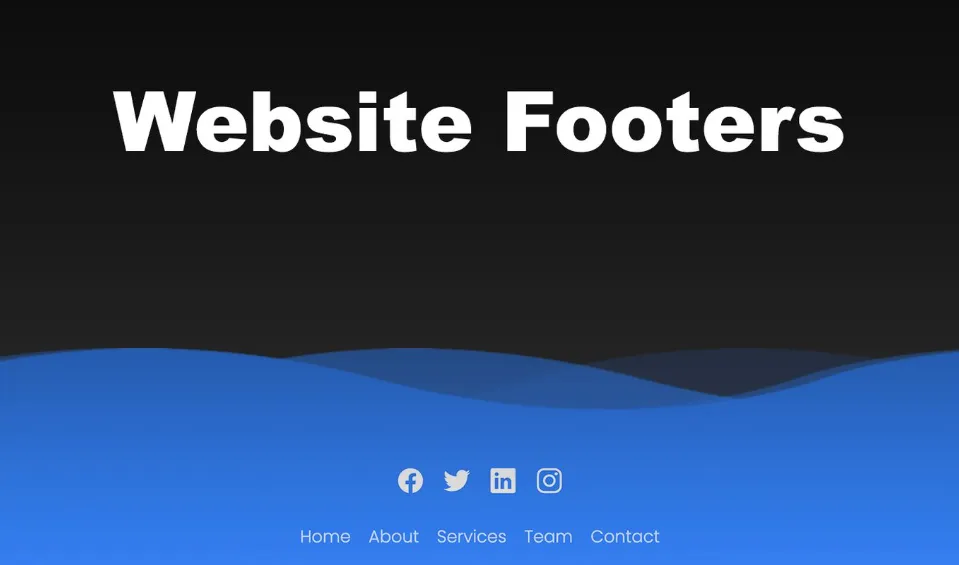
Your website’s footer might be the last thing visitors see, but it’s a crucial component that can leave a lasting impression. Crafting an effective website footer goes beyond aesthetics; it plays a vital role in user experience and SEO. In this comprehensive guide, we’ll explore website footer examples, best practices, and how you can make the most of this often-overlooked area of your site.
Understanding the Importance of Website Footers
The website footer is more than just a space at the bottom of your page. It serves as a navigation aid, providing links to important pages, contact information, and legal notices. A well-designed footer enhances user experience, improves navigation, and can even boost your site’s SEO.
Key Elements of a Well-Designed Website Footer
1. Navigation Links
Include essential links like Home, About Us, Services, and Contact. This makes it super easy for visitors to find exactly what they’re looking for in a snap!
2. Contact Information
Make it easy for users to reach out by including your contact details. This adds credibility and trust to your website.
3. Social Media Icons
Connect with your audience by adding social media icons. This encourages social engagement and expands your online presence.
4. Copyright Information
Protect your content and establish ownership by including copyright information in the footer.
Website Footer Examples for Inspiration
Looking for inspiration? Here are some website footer examples that effectively combine functionality and aesthetics:
1. Lorelei Londress
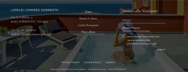
Discover the allure of Lorelei Londres, a luxurious haven in Italy that weaves together the essence of hospitality and charm. What sets this retreat apart extends beyond its plush accommodations – it’s mirrored in the thoughtful design of its website footer.
As you explore the Lorelei Londres website, the footer unfolds like a well-scripted welcome. Imagine having all your potential questions addressed seamlessly. On the left, find contact information ready at your fingertips, making communication effortlessly accessible. In the center, navigation links stand tall, guiding you through the virtual corridors of the hotel’s offerings. To the right, a discreet yet inviting newsletter opt-in form beckons, extending an invitation to stay connected with the Lorelei Londres experience. But there’s more – on the right side, privacy takes center stage. A dedicated link to the privacy policy stands prominently, accompanied by a convenient submit form directly in the footer. And just below, a cluster of crucial links awaits – from the privacy policy and cookie policy to a nod to the agency behind the website creation and a firm copyright notice. All of this is set against a captivating background image, portraying someone leisurely enjoying a pool on a balcony with a stunning beach view.
The magic lies in the simplicity and cohesion of Lorelei Londres’ footer. It’s not just a standard addition; it’s a harmonious extension of the brand. Every element is strategically placed, creating a footer that not only serves its functional purpose but also aligns perfectly with the hotel’s distinctive identity.
In essence, the Lorelei Londres website footer isn’t merely a sign-off – it’s a continuation of the five-star experience, ensuring that even the smallest details resonate with the brand’s luxury and charm.
2. Avo
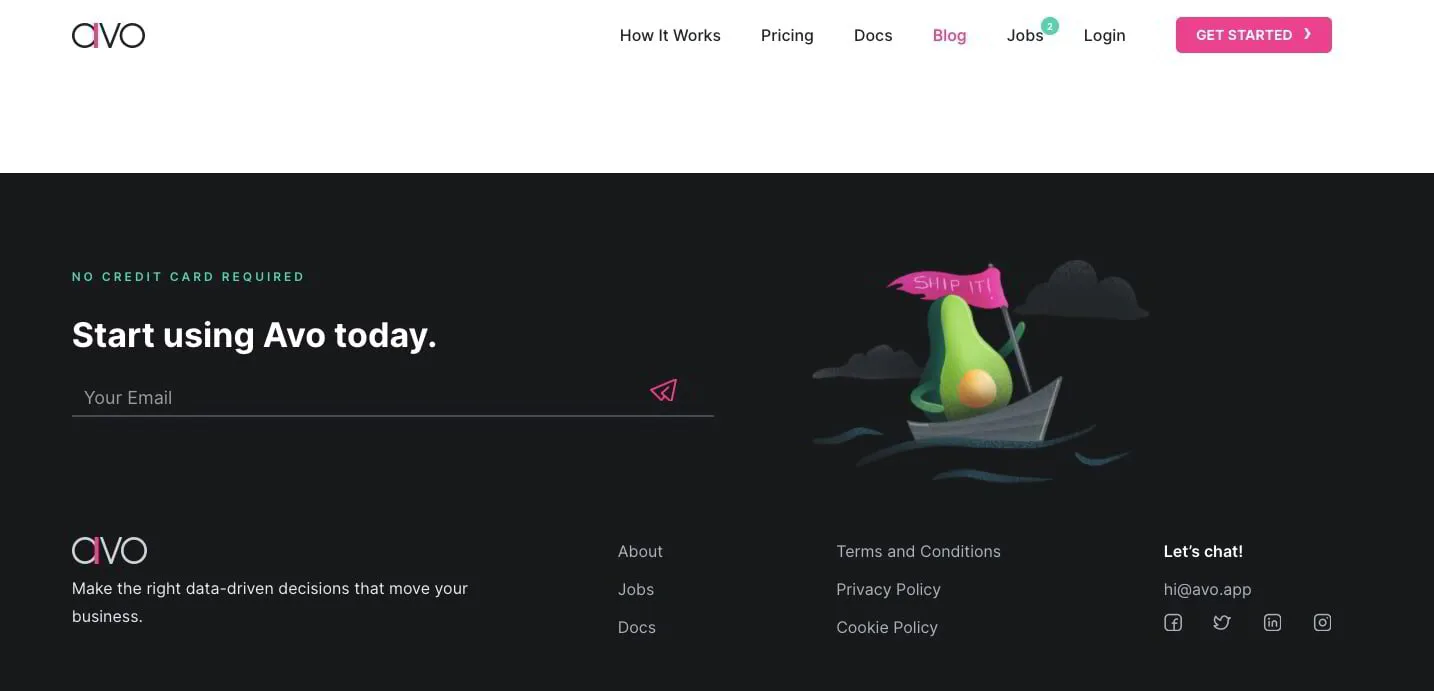
Harnessing the power of data and analytics can propel a company towards its greater mission. Avo steps in as the game-changer, providing businesses with a robust platform to effortlessly handle and tame all their crucial data. Let’s dive into the Avo website footer – it’s a real eye-catcher. The call to action boldly invites you to “Start using Avo today,” immediately drawing your attention. Right below, there’s a neat space for you to input your email address and kickstart your journey. Avo keeps it simple; there’s no overwhelming clutter of links, just a straightforward layout that speaks volumes.
Now, picture this: to the right, an adorable avocado sets sail on an oceanic adventure, perfectly symbolizing that exciting first step you’re about to take. It’s a charming touch that adds personality to the whole experience.
Take a horizontal glance, and your eyes effortlessly land on the social media icons, subtly placed on the right. It’s a thoughtful addition that makes connecting with Avo on social platforms a breeze.
What sets Avo apart is their smart approach to design – they’ve found the sweet spot by minimizing the number of links and giving each visual element ample breathing room. The result? A clean and simple footer that doesn’t just do the job but also injects the right amount of personality into the user experience.
So, whether you’re enticed by the call to action or charmed by the avocado’s aquatic escapade, Avo’s website footer is a testament to how less can indeed be more when it comes to creating a clean, simple, and personality-packed online space.
3. Pubbly
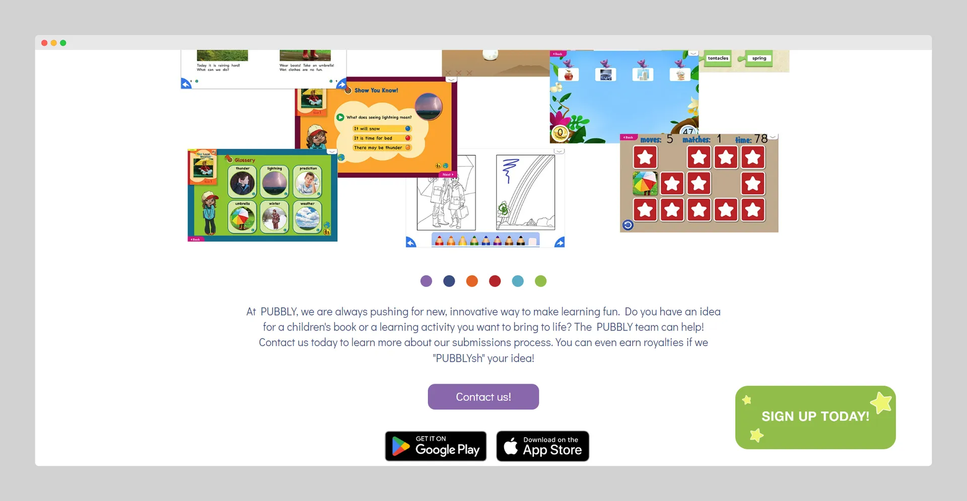
Meet Pubbly, your go-to educational platform abundant with engaging games and animated books. Now, let’s take a peek at their website footer, crafted with the same playful spirit that defines their theme.
Pubbly keeps things refreshingly simple in their footer, delivering a bold message and an enticing call to action. It’s like an invitation to explore more, right at the bottom of their page. And, just in case you’re eager to dive deeper into the world of Pubbly, they’ve conveniently placed their app download option right there in the footer.
With Pubbly, education meets entertainment, not just in their content but even in the way they’ve designed their website footer. It’s a seamless blend of simplicity and vibrancy, encouraging you to take that next step, all while keeping the learning journey as enjoyable as possible.
4. Appasaurus
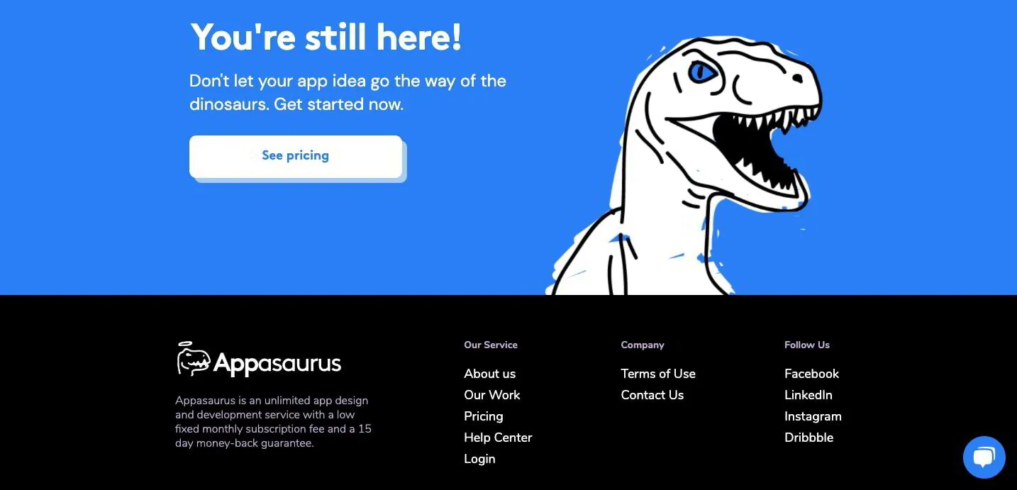
Step into the web design realm of Appasaurus, the app development agency that’s not afraid to have a little fun with dinosaurs. Picture this: their design unfolds with a quirky and humorous illustration of their team portrayed as prehistoric creatures. It’s a delightful touch that sets the tone for what follows.
Right above the website footer, there’s a parting shot of a tyrannosaurus with a cheeky reminder, “Don’t let your app go the way of the dinosaurs.” This playful tie-in seamlessly connects with the overall design, especially with the crisp white pricing button just below. Against a sleek black background that effortlessly complements white and blue, the footer emerges.
What catches the eye in this unique footer? A concise list of navigation options, along with links to their social media, all set against the backdrop of a touch of irreverence. Appasaurus proves that even in the often-overlooked website footer, a dash of absurdity can elevate the user experience, making it not just functional but downright enjoyable.
5. Tenzo
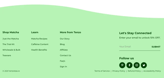
Embarking on a mission to present a refreshing alternative to coffee, Tenzo specializes in making matcha tea accessible and affordable.
As you explore their homepage, you’ll notice multiple calls-to-action (CTAs) encouraging you to give their matcha a try, backed by a confidence-boosting money-back guarantee. Now, let’s not forget the enticing offer waiting for you in the website footer – a 10% discount awaits if you share your email. Want to keep up without sharing your email? No worries – follow Tenzo on Pinterest, Facebook, Instagram, or Twitter directly from the footer.
But there’s more to the footer magic. For those seeking diverse ways to purchase Tenzo’s products or eager to delve deeper into the world of matcha and the company itself, the footer is a treasure trove of important links.
In essence, Tenzo’s website footer isn’t just a sign-off; it’s a strategic hub designed to captivate both potential and exploring customers, making every visit a delightful journey.
Best Practices for Optimizing Your Website Footer
To make the most of your website footer, consider the following best practices:
1. Keep It Simple: Avoid clutter. A clean and organized footer is more visually appealing and user-friendly.
2. Responsive Design: Ensure your footer looks good on all devices. A responsive design improves the user experience across various screen sizes.
3. Hierarchy of Information: Prioritize information in your footer. Important links should stand out, guiding users to relevant content.
How to Design a Mobile-Friendly Footer
With the increasing use of mobile devices, optimizing your footer for smaller screens is crucial. Follow these tips:
1. Keyword Placement: Strategically include relevant keywords in your footer content to improve search engine visibility.
2. Internal Links: Use the footer to include internal links to important pages, spreading link equity throughout your site.
3. Sitemap: Consider adding a sitemap link in the footer to assist search engines in indexing your site.
SEO Tips for Your Website Footer
Your website footer can impact your SEO efforts. Here are some tips to enhance your site’s search engine optimization:
1. Keyword Placement: Strategically include relevant keywords in your footer content to improve search engine visibility.
2. Internal Links: Use the footer to include internal links to important pages, spreading link equity throughout your site.
3. Sitemap: Consider adding a sitemap link in the footer to assist search engines in indexing your site.
Common Mistakes to Avoid in Website Footer Design
While optimizing your website footer, be cautious about common mistakes that can hinder user experience:
1. Overloading with Links: Too many links can overwhelm visitors. Stick to essential links for a cleaner design.
2. Ignoring Mobile Users: Ensure your footer is as user-friendly on mobile devices as it is on desktops.
3. Outdated Information: Regularly update your footer with current information to maintain credibility.
Conclusion
Your website footer is a valuable space that can significantly contribute to a positive user experience. By implementing the best practices and drawing inspiration from effective examples, you can create a footer that not only looks appealing but also serves its purpose seamlessly

