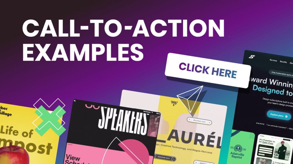
In the digital landscape, a compelling call-to-action (CTA) is essential for driving user engagement and conversions. Whether you’re aiming to boost sales, grow your email list, or encourage social media follows, a well-crafted CTA can make all the difference. In this blog, we’ll explore 30 powerful call-to-action examples that are designed to grab attention and prompt action.
Introduction to Call-to-Action
A call-to-action is an invitation that urges users to perform a specific task. It’s a critical element of web design and marketing, guiding visitors toward your business goals. An effective CTA is clear, enticing, and relevant to the user’s needs and interests.
Key Elements of a Successful CTA
Before diving into our call-to-action examples, let’s look at what makes a CTA effective:
1. Clarity
Your CTA should be straightforward and leave no room for ambiguity. Visitors should immediately understand what action they’re expected to take.
2. Urgency
Generate a feeling of urgency to drive visitors to take prompt action. Phrases like “limited time offer” or “only a few left” can prompt immediate responses.
3. Value
Highlight the benefit or value that users will receive by taking the action. Whether it’s a discount, free trial, or exclusive content, make it clear what’s in it for them.
4. Visibility
Ensure your CTA stands out on the page. Use contrasting colors, strategic placement, and eye-catching design to draw attention.
30 Powerful Call-to-Action Examples
Here are 30 call-to-action examples that can help you boost engagement and conversions:
1. “Get Started Free”
Encourage users to try your product or service with no initial commitment. Great for software trials or subscription services.
2. “Download Now”
Ideal for promoting free resources such as eBooks, guides, or whitepapers. It’s a straightforward way to offer valuable content.
3. “Join Our Newsletter”
Perfect for building your email list. Make sure to highlight the benefits of subscribing, like exclusive updates or special offers.
4. “Shop Now and Save”
Incorporate a discount or special offer to entice users to make a purchase. Great for e-commerce websites.
5. “Learn More”
Use this CTA to encourage visitors to explore additional information about your product or service. It’s useful for detailed content or educational material.
6. “Schedule a Demo”
Ideal for B2B businesses offering software or services. Give potential clients a firsthand look at your product in use.
7. “Get a Quote”
Encourage users to request a quote for your services. This is effective for businesses offering custom solutions or pricing.
8. “Claim Your Free Trial”
Offer a free trial to attract users who are hesitant to commit. Make sure to clearly outline the trial’s features and duration.
9. “Buy Now”
A direct and assertive CTA for driving immediate sales. Perfect for product pages and special promotions.
10. “Subscribe Today”
Encourage users to subscribe to your service or membership. Highlight any benefits or exclusive content they’ll receive.
11. “Discover More”
Prompt users to explore additional content or features. This is great for blogs, resource centers, or product catalogs.
12. “Start Your Journey”
Use this CTA to guide users through a process or experience. It’s effective for onboarding or guided tours.
13. “Get Instant Access”
Create a sense of urgency and exclusivity by offering immediate access to content or features. Ideal for gated content or membership sites.
14. “Find Out How”
Encourage visitors to learn more about how your product or service works. This is effective for complex offerings or solutions.
15. “Take the Quiz”
Engage users with interactive content. Quizzes can be a fun way to gather information and lead users to personalized recommendations.
16. “See the Difference”
Showcase what makes your product or service unique compared to competitors. This is great for comparisons or product demonstrations.
17. “Get Your Free Consultation”
Offer a free consultation to potential clients. This is effective for service-based businesses looking to attract new clients.
18. “Join the Community”
Encourage users to become part of your brand’s community or forum. This helps build engagement and loyalty.
19. “Request a Callback”
Allow users to request a call from your sales team. This is effective for businesses that rely on personal interactions.
20. “Try It Risk-Free”
Offer a risk-free trial to alleviate concerns and encourage users to try your product. Make sure to clearly state the trial terms.
21. “Reserve Your Spot”
Create urgency by encouraging users to reserve a spot for an event or webinar. This is ideal for limited availability situations.
22. “Unlock the Deal”
Entice users to unlock a special offer or discount. This can increase conversions and drive sales.
23. “Read the Case Study”
Use this CTA to direct visitors to in-depth case studies or success stories. This builds credibility and showcases your results.
24. “Follow Us on Social Media”
Motivate visitors to engage with your brand through social media channels. Highlight the benefits of following, such as exclusive updates or content.
25. “See How It Works”
Guide users to a demo or explainer video. This is effective for products or services that benefit from visual explanations.
26. “Claim Your Gift”
Offer a free gift or incentive to attract users. This is great for lead generation or promotional campaigns.
27. “Update Your Preferences”
Encourage users to update their email preferences or communication settings. This helps tailor content to their interests.
28. “Download the App”
Promote your mobile app with a clear CTA. Emphasize the advantages and features of your app to boost downloads.
29. “Get the Best Price”
Attract users by offering the best price or deal. This can be effective for seasonal promotions or special offers.
30. “Act Now”
Foster a sense of urgency to compel immediate response. This is effective for time-sensitive offers or limited-time promotions.
Frequently Asked Questions (FAQs)
Q1: How can I make my CTA stand out on my website?
A1: To make your CTA stand out, use contrasting colors, bold text, and strategic placement. Ensure it’s above the fold and easily accessible. Additionally, use action-oriented language and create a sense of urgency to grab attention.
Q2: How often should I use CTAs on my website?
A2: Use CTAs strategically throughout your website. Include them on landing pages, product pages, blog posts, and in your email campaigns. Avoid overloading users with too many CTAs; instead, focus on placing them where they will be most effective.
Q3: What are some common mistakes to avoid with CTAs?
A3: Common mistakes include using vague language, placing CTAs in less visible areas, and failing to provide a clear value proposition. Ensure your CTAs are specific, compelling, and placed prominently on your page.
Q4: How can I test the effectiveness of my CTAs?
A4: Use A/B testing to compare different versions of your CTAs. Test variations in wording, color, placement, and design to see which performs best. Analyze metrics like click-through rates and conversion rates to determine effectiveness.
Q5: Should I use the same CTA across all my marketing channels?
A5: While the core message of your CTA can remain consistent, tailor it to fit each marketing channel’s context. Adapt the wording and design to align with the platform’s format and audience expectations.
Conclusion
Crafting an irresistible call-to-action is essential for driving user engagement and achieving your business goals. By using these 30 powerful call-to-action examples, you can create compelling prompts that capture attention and prompt visitors to take meaningful actions. Remember to focus on clarity, urgency, value, and visibility to make your CTAs as effective as possible.
Feel free to experiment with these examples and adapt them to your specific needs. With the right approach, you can turn your visitors into loyal customers and drive the results you’re aiming for.


