When it comes to branding, a logo is much more than just an image. It’s a visual representation of a company’s identity, its values, and often, the first impression potential customers get of the brand. Some of the best logos are iconic, instantly recognizable, and evoke a strong emotional response. They tell a story without saying a word and leave a lasting impression. But what makes a logo stand out, and what can we learn from some of the world’s most famous logos?
In this blog, we’ll take a look at 25 of the best logos that have shaped industries and inspired countless designers. Whether you’re creating your own brand or just want to understand what makes a great logo, there’s a lot to learn from these timeless designs.
What Makes a Logo Great?
Before we dive into the best logos, let’s break down what makes a logo great. A logo should be:
- Simple: Complexity can make a logo difficult to recognize or remember. Simplicity often equals longevity.
- Memorable: A great logo sticks in your mind, even after a brief glance.
- Timeless: While trends come and go, the best logos stand the test of time.
- Versatile: A logo should work across various mediums, from websites to billboards to business cards.
- Relevant: A logo should reflect the brand it represents and communicate the right message to its audience.
25 of the Best Logos to Learn From
1. Apple
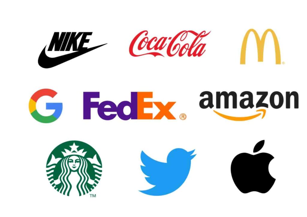
The Apple logo is one of the most iconic in the world. The simple silhouette of an apple with a bite taken out of it is immediately recognizable. What makes it one of the best logos is its clean design, scalability, and timelessness.
2. Nike
The Nike “Swoosh” is synonymous with movement, speed, and athleticism. Designed by a student for just $35, the Swoosh is a perfect example of how simplicity can have an enormous impact.
3. McDonald’s
McDonald’s golden arches are among the most recognizable symbols in the world. The simplicity of the arches and their association with fast food and convenience makes this one of the best logos in global branding.
4. Coca-Cola
The Coca-Cola logo, with its flowing script and bright red color, has remained almost unchanged for over a century. Its timeless design evokes feelings of nostalgia and happiness, a masterclass in brand consistency.
5. Google
The Google logo is deceptively simple yet incredibly powerful. Its bright, playful colors represent the company’s innovative and creative approach to technology. The logo’s clean and minimal design helps it stand out.
6. FedEx
FedEx’s logo is not just clever but brilliant in its subtlety. The hidden arrow between the “E” and “X” represents speed and precision, core values of the brand. It’s a perfect example of how hidden meaning can add depth to a design.
7. Amazon
The Amazon logo is simple yet genius in its message. The arrow that goes from “A” to “Z” conveys that Amazon sells everything, while also doubling as a smile, signifying customer satisfaction.
8. Adidas
Adidas has a logo that’s instantly recognizable by sports enthusiasts. The three stripes, designed to look like a mountain, represent the challenges athletes face, making it one of the best logos in the sports industry.
9. Starbucks
Starbucks’ mermaid logo has evolved over time, but its uniqueness has always remained. The intricate design reflects the company’s roots in Seattle and its connection to the sea.
10. Pepsi
Pepsi’s circular logo, with its red, white, and blue waves, creates a sense of movement and energy. Its simplicity makes it recognizable across the globe, while its colors resonate with patriotic themes in the United States.
11. BMW
BMW’s logo, with its blue and white quadrants, is inspired by the Bavarian flag, nodding to the company’s German roots. The circular design conveys a sense of engineering precision and quality.
12. Mercedes-Benz
The three-pointed star in the Mercedes-Benz logo represents the company’s ambition to dominate land, sea, and air. It’s a symbol of luxury, power, and precision engineering, making it one of the best logos in the automotive industry.
13. Twitter
The Twitter bird has become a modern symbol for communication. Its light, whimsical design represents the platform’s core purpose: short, fast interactions.
14. Target
Target’s simple red bullseye is instantly recognizable, whether on a shopping bag or a billboard. Its clean design and bold color create a strong connection to the brand’s mission of being a one-stop shopping destination.
15. Shell
The Shell logo, with its distinctive yellow and red scallop shell, has remained largely unchanged for decades. Its simplicity and connection to the company’s name make it memorable and timeless.
16. Chanel
Chanel’s interlocking C’s exude luxury, sophistication, and timeless style. It’s a classic example of how a logo can reflect a brand’s values perfectly.
17. Lego
The Lego logo is bright, playful, and instantly recognizable, just like the products it represents. Its bold, blocky letters capture the essence of the brand’s fun and creative nature.
18. Netflix
Netflix’s simple yet bold design, with its sleek red text, has become synonymous with streaming entertainment. Its straightforward look reflects the platform’s easy-to-use interface and wide-ranging appeal.
19. Spotify
Spotify’s logo features simple sound waves inside a circle, representing music streaming. Its minimal design makes it instantly recognizable while capturing the essence of the brand.
20. IBM
IBM’s iconic logo, with its horizontal stripes, gives off a feeling of stability, innovation, and trust. It’s one of the best logos in the tech industry for its ability to communicate strength and dependability.
21. Mastercard
Mastercard’s logo uses two overlapping circles in red and yellow to represent connectedness and financial transactions. Its design is simple yet elegant, making it one of the most recognizable financial logos.
22. Volkswagen
Volkswagen’s clean and simple “VW” logo is a masterclass in clarity and simplicity. Its circular design and balanced lettering reflect the brand’s focus on precision engineering and quality.
23. Pringles
The Pringles logo is playful and fun, featuring a mustachioed mascot that adds personality to the brand. Its bold colors and quirky design make it memorable, especially among snack brands.
24. Instagram
Instagram’s camera icon has evolved over the years, but it remains instantly recognizable. Its colorful gradient and simple camera shape perfectly reflect the app’s focus on photography and creativity.
25. Disney
Disney’s castle logo is iconic, representing magic, fantasy, and imagination. Its detailed design evokes feelings of nostalgia and wonder, making it one of the best logos in entertainment history.
Key Takeaways From the Best Logos
What do these best logos have in common? Here are some key lessons you can apply to your own branding:
- Keep it simple: The simpler the design, the more likely it will be remembered.
- Make it relevant: Your logo should reflect your brand’s values and resonate with your target audience.
- Be timeless: Avoid trends that could make your logo look outdated in a few years. Aim for a design that will stand the test of time.
- Be versatile: Ensure your logo works well in different formats and mediums, from digital screens to print.
- Consider hidden meaning: Adding subtle details can make your logo more interesting and memorable, as demonstrated by logos like FedEx and Amazon.
FAQs About the Best Logos
Q: What makes a logo one of the best?
A: A logo that is simple, memorable, timeless, versatile, and relevant to the brand is typically considered one of the best logos. It effectively communicates the brand’s identity while resonating with its audience.
Q: Why is simplicity important in logo design?
A: Simplicity helps make a logo more recognizable and memorable. Complex designs can be harder to recall and may not work well in all formats, especially on smaller screens.
Q: How can I create a timeless logo?
A: Focus on clean lines, strong fonts, and avoid trends that may not age well. Timeless logos prioritize clarity and relevancy over trendy or overly complex designs.
Q: Should a logo change over time?
A: While a great logo is often timeless, it may require small adjustments or refinements to stay fresh and relevant as the brand evolves. However, the core identity should remain consistent.
Q: Can color impact how a logo is perceived?
A: Absolutely! Colors evoke emotions and can influence how a logo is perceived. For example, red can convey energy and passion, while blue can represent trust and reliability. Choosing the right colors is crucial for effective logo design.
Conclusion
The best logos tell a story, create an emotional connection, and stand the test of time. Whether you’re creating a logo for your own brand or simply appreciating the art of design, there’s a lot to learn from these iconic examples. Keep it simple, make it memorable, and most importantly, ensure your logo reflects the essence of your brand.
These 25 best logos have shaped industries and become symbols of creativity, trust, and innovation. By studying their design, you can gain valuable insights and inspiration for creating a logo that will resonate with your audience for years to come


