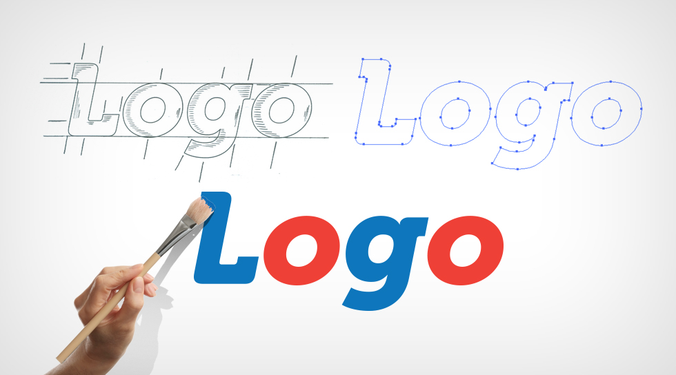
Creating a logo is more than just picking colors and fonts. It’s about capturing the essence of your brand in a single visual mark. A well-designed logo is a powerful tool that can make your brand instantly recognizable and memorable. But what makes a good logo? In this guide, we’ll walk you through the dos and don’ts of logo design to help you create a logo that truly represents your brand.
Introduction
A logo is often the first thing people see when they encounter your brand. It’s not just a random design; it’s a visual representation of your company’s identity. Your logo should be straightforward, easy to recall, and adaptable across different platforms. But with so many design options, it can be challenging to know where to start. This guide will help you understand what makes a good logo by outlining the essential dos and don’ts of logo design.
The Dos of Logo Design
1. Do Keep It Simple
One of the key aspects of what makes a good logo is simplicity. A straightforward logo is more likely to be recognized and stay in people’s minds. It’s also more versatile, working well across different mediums and sizes. Think of iconic logos like Nike’s swoosh or Apple’s apple – they’re straightforward yet instantly recognizable.
2. Do Make It Memorable
A good logo should stick in people’s minds. To achieve this, your logo needs a unique element that makes it stand out. Whether it’s a clever use of negative space or an unexpected color combination, creating a logo that people can easily recall is crucial.
3. Do Consider Your Brand’s Identity
Your logo should reflect your brand’s personality and values. Before you start designing, take some time to think about what your brand stands for. Does your brand convey a playful vibe, or is it more serious and formal? The design elements you choose should align with your brand’s identity.
4. Do Use Appropriate Colors
Colors play a significant role in logo design. Different colors evoke different emotions and perceptions. Take blue, for instance; it often represents reliability and professionalism, whereas red can symbolize excitement and energy. Choose colors that represent your brand’s essence and make sure they work well together.
5. Do Ensure It’s Versatile
A good logo should look great in any context, whether it’s on a business card, a billboard, or a mobile app. This means it should be scalable, work in both color and black-and-white, and be adaptable to various formats. Versatility is key to a logo’s success.
6. Do Seek Feedback
Before finalizing your logo, get feedback from others. This could be from colleagues, friends, or even potential customers. Sometimes, a fresh pair of eyes can catch something you’ve missed or offer insights that improve the design.
The Don’ts of Logo Design
1. Don’t Overcomplicate the Design
While it might be tempting to include intricate details, too much complexity can make your logo hard to understand and remember. Overcomplicating the design can also create problems when the logo is scaled down for smaller applications.
2. Don’t Follow Trends Blindly
Trends in design are fleeting, but your logo needs to be enduring and timeless. While it’s okay to be inspired by current trends, avoid creating a logo that relies too heavily on them. A timeless design will remain effective and relevant for years to come.
3. Don’t Use Too Many Colors
Using too many colors can make your logo look chaotic and unprofessional. Stick to a limited color palette that complements your brand and maintains visual harmony. Remember, simplicity in color choice is part of what makes a good logo.
4. Don’t Ignore Font Choice
Fonts are an integral part of your logo’s design. Choosing the wrong font can completely change the message your logo sends. Avoid overly decorative or complex fonts that can make your logo hard to read. Choose a concise color scheme that enhances your brand and keeps a balanced visual appeal.
5. Don’t Rely on Stock Images or Clip Art
Using stock images or clip art can make your logo look generic and unoriginal. A good logo should be unique and custom-made for your brand. Invest in original design elements that set your logo apart from the competition.
6. Don’t Forget About Your Audience
Your logo is for your audience, not just for you. Keep in mind who your target audience is and what will resonate with them. A design that appeals to your audience is essential for creating a successful logo.
What Makes a Good Logo?
When it comes to what makes a good logo, the answer lies in a combination of simplicity, memorability, versatility, and alignment with your brand’s identity. A good logo doesn’t need to be flashy or complicated; it needs to be a clear and effective representation of your brand. By following the dos and don’ts outlined above, you can create a logo that not only looks great but also serves its purpose in building brand recognition and trust.
FAQs
Q: What makes a good logo?
A: A good logo is simple, memorable, versatile, and aligned with your brand’s identity. It should be easy to recognize, work well across various platforms, and represent your brand’s values.
Q: How many colors should a logo have?
A: Ideally, a logo should have no more than two to three colors. This helps maintain simplicity and ensures the logo looks good in different formats.
Q: Why is simplicity important in logo design?
A: Simplicity is important because it makes the logo easier to recognize and remember. A simple logo is also more versatile and can be used across various mediums without losing its effectiveness.
Q: Can I use clip art in my logo?
A: It’s best to avoid using clip art in your logo. Clip art can make your logo look generic and unoriginal. A custom-designed logo will be more unique and better represent your brand.
Q: How do I choose the right font for my logo?
A: Choose a font that matches your brand’s personality and is easy to read. Avoid overly decorative fonts that can be hard to understand, and stick to clean, simple fonts that convey your brand’s message clearly.
Conclusion
Designing a logo is an important step in establishing your brand’s identity. By understanding what makes a good logo and following the dos and don’ts of logo design, you can create a logo that not only looks great but also effectively represents your brand. Keep it simple, make it memorable, and ensure it’s versatile – these are the key elements of a successful logo.
4o


